Wednesday, 4 December 2013

Origami Packaging

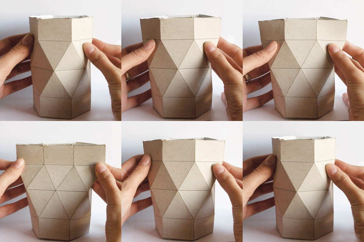
Origami packaging has become more and more popular over recent years and is especially good at reducing waste. Keeping in mind the eco-friendly benefits of origami packaging, I decided to research further into the subject.


Popup Paris

French company, Popup Paris, released a candle that may, “reveal a 0.15-0.25 carat diamond when the wax burns - as one is hidden within every 50 candles.” The packaging for this product is inspired by origami folds. It opens up into a geometric shape. Bold colouring has been used, softened on the outside of the packaging with a recurring pattern. It is also eco-friendly, for it has been created from recycled material. 


Doritos

This doritos packaging is a concept that appeared multiple times during my research, descried as an innovative piece of packaging. This has been designed by Peter Pavlov and the design takes influence from origami. It appears to be made up of triangles, which relates the packaging back to the product. The lid can be easily folded into place and opened, with no extra material required. Pavlov writes that the final form of the packaging resembled a simplified totem, which relates back to ancient ancestors of Mexico, the Aztecs. The packaging is also made out of environmentally-friendly cardboard, meaning that the natural texture of the material resembles that of the chips. I love how so many considerations like this has gone into the packaging production. Everything links back to the product.


The Sustainable Expanding Bowl

This has been designed by Anna Glancen, Hanna Billquist and Swedish research company Innventia. The packaging (which comes flat) expands into a bowl, which the user can eat from, when hot water is added. It is made from bio-based and bio-degradable materials, making it beneficial for the environment, while the folds and appearance clearly mark origami as an influence. The report of this product, seen on the Dieline, says “As consumers increasingly expect sustainable packaging to have intelligent, reactive design attributes, brands will continue to produce more packs with transformational properties.”


This Is Origami

Deigned by Magdalena Czarnecki.

The packaging of this product has been given a secondary use, to be put into use after its initial purpose is complete. Simple step-by-step instructions have been included on how to fold the bag into an origami animal. The money raised then goes to the WWF, going towards helping save endangered animals. It is a fun and quirky idea and the packaging is beautiful.


Jurlique

This box, designed for Australian cosmetic brand Jurlique, is made out of a single sheet, created through a series of origami folds. It is held together with a single tab and once this tab is removed, the box opens to reveal the product and the bold graphical print inside. This also reduces the amount of packaging used, while the box is made from recycled card. This is a fun design, which is incredibly easy to open, saving the fuss of having to rip into tough plastic. 


Senba Tea

The origami cranes are a symbol of peace and calm in Japanese culture. The packaging for Senba tea is made from triangles, the main shapes used to make these cranes. When the links of these papers are hung from the side of a cup, they resemble the appearance of the origami cranes. The triangular packaging opens to display a single tea bag.
The materials used in this packaging, including the box, are recyclable. Not only that, but the fabric is made from corn and any glue that has been used is made from plants, meaning that it is bio degradable.
The design is practical, beautiful and environmentally-friendly.


Chocolate Hare

This design was created to celebrate the chinese new year. At the time of its production, it was the year of the hare, and so this was incorporated into the design. The wrapper reads: "Happy New 2011 Year! Please don't throw the wrapper. You can make a Origami Bunny out of it. An instructional leaflet is attached under the wrapper.”.
This product is trying to reduce waste and does this by giving the packaging a secondary use; making an origami hare out of the wrapper! The design is also very strong, with the bright, bold red and subtle shapes that link to origami.


Overall, I feel that origami packaging is intricate and wholly unique. If pulled off correctly, it looks very impressive and also adds a playful edge to a design. It is also very environmentally-friendly However, I ultimately don't think that it is suited for packaging paint, as it isn't strong enough.


References:
http://abduzeedo.com/project-study-doritos-package
http://www.thedieline.com/blog/2013/10/1/the-future-of-sustainable-packaging-is-about-being-smarter-a.html
http://www.thedieline.com/blog/2013/6/23/the-dieline-package-design-awards-2013-sustainable-packaging.html

Thursday, 28 November 2013

Materials

As Jo put in his lecture for CAT, “These things are complicated." He went on to say that choosing materials is not as easy as saying that steel, for example, is bad. You have to look at all aspects of that material and work out if it is indeed the best one for the job.

In Jo's presentation, we learned that aluminum used 170 mega jewels of energy to produce - an enormous amount. Cardboard uses 24.2 and plastic uses 90. Jo explained, Generally the more processing the material has, the more energy it takes.”


However, he also explained how production could differ depending on which country you are producing the metal in. For example, in Nigeria it takes 7.5 times as much energy than if you were to make a kilogram of steel in the UK, as UK technology is more advanced. In China, it would take twice as much energy, yet in South Korea and Denmark, it would take half as much energy to create a kilogram than it would in Britain.

I researched further and it was revealed to me that aluminum is 100% recyclable. It can also be melted down and reformed without losing any quality and this process can be repeated again and again. In fact, recycling 1 ton of aluminum saves 9 tons of CO2 emissions. So although aluminum is actually one of the most costly (on the environment too) metals to produce, recycled aluminum is actually very good. Aluminum is a very versatile metal and very light (a third of steel's weight).

When researching into what materials would be good for paint containers, I came across the metal tinplate. This metal is resistant to different temperatures, impervious to light, gas and diffusion, is strong and light and is good for protecting products. I came across the company Huber packaging and they use this metal in the packaging of their paints. For water-based products, they use cans that are lacquered on the inside. They explain, "The interior lacquer prevents the content from coming into direct contact with the tinplate and the welded seam is protected by a powder striping."


I also found that tinplate containers are reusable. In fact, they are endlessly recyclable. They do not degrade each time they are recycled like glass, paper and plastic. Another benefit of using tinplate is a reduced Carbon footprint and a saving of approximately 75% of energy consumption. I think this is a metal I would definitely consider using when designing my packaging.

Tuesday, 26 November 2013

CAT (Blog Task)

1. Had you heard of CAT before you came on the module? If 'yes' then please give an idea where you'd heard about them.

No, I hadn't heard of CAT before our visit.


2. Please give your thoughts on the 3x most notable points raised in the sustainability lecture on site. For example it could be methods of reducing CO2 discussed, the varying views of the 'future' given the issues of oil and climate change or maybe the idea of 'real worth' with materials and artifacts (i.e. remember Jo explaining that one torch would appear to be the most sustainable but in practice another was simpler and more effective).


  • I thought it was definitely an eyeopener when Jo said that one their goals at CAT was to achieve a 100% cut of carbon emissions, which would address all parts of society. This seemed highly ambitious to me, yet it also seems to be necessary.

  • I also found it worrying to know that we in Britain were using up more than our fair share of the planet. If everyone behaved as we did, we would need three planets to sustain us. It seems that some cuts would have to be put in place.

  • In regards to this, Jo explained that a lot of countries didn't have a healthy balance. For example, poorer countries were not using up many resources, yet they were also poor places to live. And in Britain and America, living conditions and education were great, yet we were using up too much. Jo explained that Cuba was a country that had the best balance; it wasn't using up too many resources, yet it was still a good place to live in terms of conditions and education. 

  • I also knew that oil was running out, yet I had no idea that metals such as copper had about 40 years left if we continued to use it the way we were, while led and zinc have only about 20 years left.

3. Please give your thoughts on the 3x most notable things picked-up while at CAT (i.e. it could be one of the specific exhibits seen, their self sufficiency with solar etc and/or maybe the clever use of materials with specific buildings to help reduce CO2 etc).

  • I was interested in the alternative materials they used to keep their buildings running smoothly. Like using sheep wool as insulation, for example.

  • There was also a house that you could look around and throughout its different rooms there was information explaining how you could make your home more energy efficient. 
     
  • They had installed an electricity-generating photovoltaic (PV) roof and next to it they had a panel to show how much energy it was generating at the moment (600 watts when we visited), how much it had generated since installation (61566 kWh) and how much Greenhouse Gas emission had been saved (35092 kg).


4. Now you've had time to reflect, what 3x things gained from the CAT visit might you bring forward into your ideas and developments for the sustainable packaging brief?

  • Thinking of what materials would be the best to use for project. For example, I learned that some metals take more energy to produce than others.

  • I was also inspired to experiment more with different materials, those that might not seem as obvious for the job.

  • Making sure my packaging is energy efficient and doing its bit toward helping the environment.

Sunday, 24 November 2013

Farrow & Ball & ECOS Organic Paints: Futher Designs

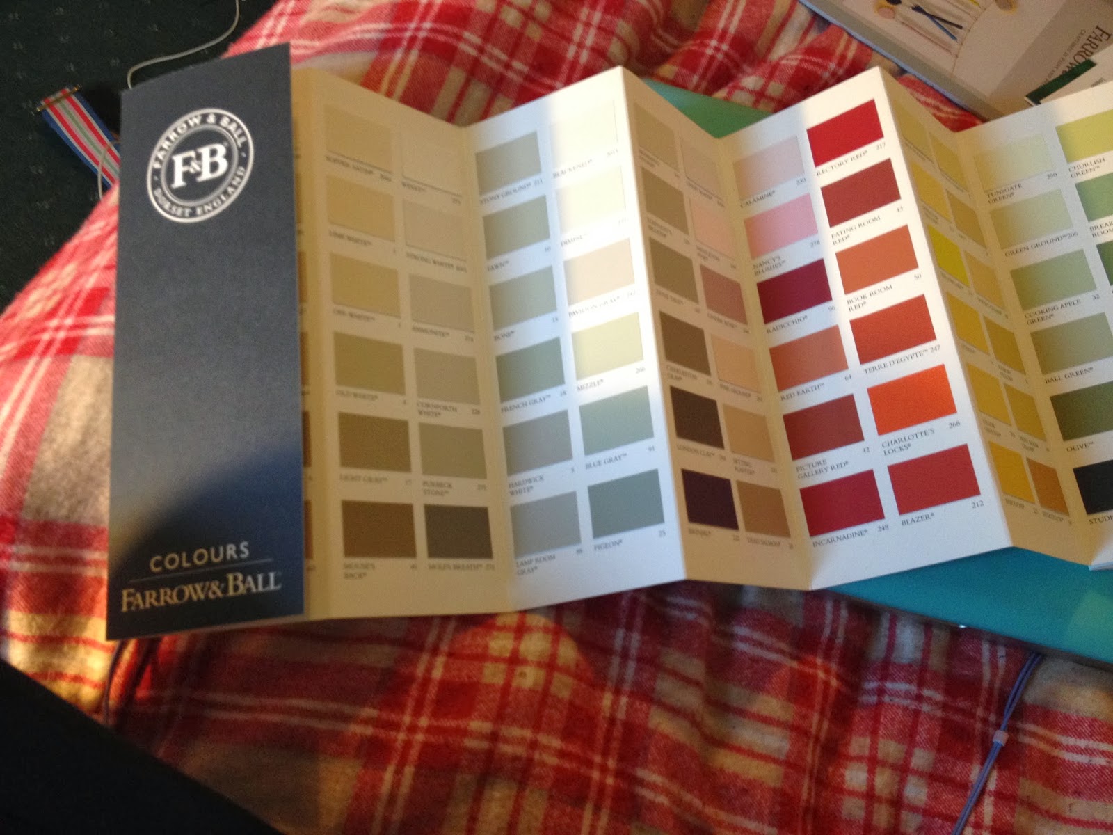
I ordered colour swatches from my clients competitors to get a better idea about the graphic design of their companies.

Farrow & Ball definitely has a sleek, professional look that is carried through on their colour swatch and their promotional leaflets. There is something very aesthetically pleasing about the long, thin colour swatch, the front which contains only two colour (white and a very dark navy blue) and their logo. It looks incredibly sophisticated.

Their promotional leaflet, meanwhile, shows rich architecture and furniture, clearly marking who their intended audience is. I think that it might be fun to experiment with the design of typical markings seen on ornate wallpapers and architecture; perhaps this could be a pattern to take forward in my own design.

ECOS mimics the Farrow & Ball colour swatch, in that both designs are the same tall, thin size, use a minimal amount of colour and display only their logo on the front. However, ECOS Organic Paints seems a lot friendlier somehow, perhaps in the light use of colour - and yet I think a certain air of sophistication is lost, especially on the back pages. I think it their use of sans-serif typefaces, while Farrow & Ball uses serif; it just seems more traditional and elegant.


FARROW & BALL


ECOS ORGANIC PAINTS


COMPARISON
Back pages. Farrow & Ball (Left) - ECOS (Right)
Information on back. Farrow & Ball (top) - ECOS (bottom)
Front pages.

Monday, 18 November 2013

Creative Brand Identities (3)

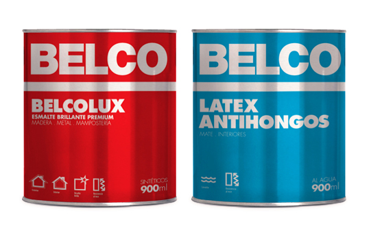
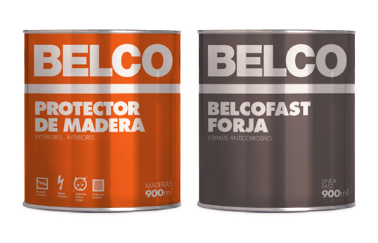
Belco Paint

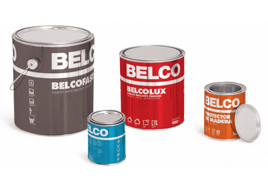
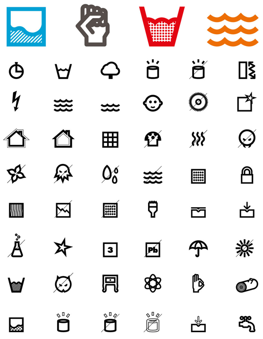
This is a design for Belco Paint by Atolรณn de Mororoa from Uruguay. The project involved redesigning four lines of products and bringing them up to date. To achieve this Mororoa created a colour identification system. To highlight the properties of each product they also created numerous icons, to symbolise different properties. 
 
The design is very simplistic, with little more than typography being used. Yet the texture of the background gives the label a shiny appearance, which immediately attracted me, as it adds another dimension to a otherwise flat label.

The shape of the tins I have been looked at all seem consistently like this one, both in height, width and the inclusion of handles. I think this is the type of tin people feel comfortable with when it comes to paint. Immediately, by using this type of container, the paint is trustable and appears of high quality. 


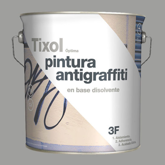
Trixol
The paint company Tixol created a range of white insulating treatments with different finishes. The solution was designed by Eduardo del Fraile from Spain.

The concept of the background of this design was to represent the action of the paint once it had been used over different backgrounds. The diagonal white line represents the final finish of the product. This is getting the message across that this is a powerful paint that will cover your walls easily, no matter of what is currently on them.

Again, there is use of simplistic sans-serif typography, which I am seeing a lot of as I research into these creative ideas for paint packaging. I definitely think the use of this typeface makes the packaging appear fresh and modern, which reflects well on the paint itself.

Back:

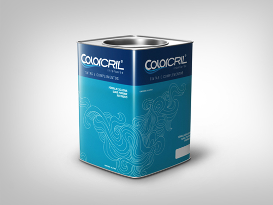
Colorcril
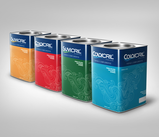
This was designed by Mariella Leal from Brazil for the company Colorcril. The colour of the tin is the same colour as the paint that is inside. I was particularly interested in the shape of this tin, for it was square, not like the rounded paint tins I am used to seeing. However, I think this would make the product stand out amongst its competitors and it gives the paint a more creative edge. The design of the tin is simplistic; it lets the colour do the talking. A white pattern is placed over the colour to add that extra flourish of detail. It looks almost like a wave to me. 


Steen-Hansen

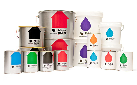
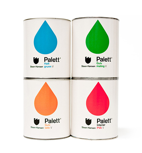
This design was created by Kleivan Schnitler for one of the oldest paint factories in Norway, Steen-Hansen. The vibrant colours will certainly make the design stand out on a shelf. I would personally like to see what the packaging would look like with a black background - for some reason white backgrounds tend to say “cheap”, perhaps this is because white backgrounds are always in use on the design of the store's cheap personal brand. Though, at the same time, perhaps the bright colours would not 'pop' as much on a background that wasn't as neutral as white.

The packaging for these products have made from plastic and metal. This seems like the go-to materials of paint packaging, which I have discovered through this research. However, are they the best environmentally-friendly materials? 


References: 
http://lovelypackage.com/belco/#more-20607 
http://thegrid.soup.io/tag/Paint
http://www.tixol.es/


Creative Brand Identities (2)

YOLO Colorhouse

YOLO Colorhouse is brand of paints that also looks to be environmentally-friendly. You can see their thoughts on VOC's here: http://www.yolocolorhouse.com/learn-home/zero-and-low-voc-paint/
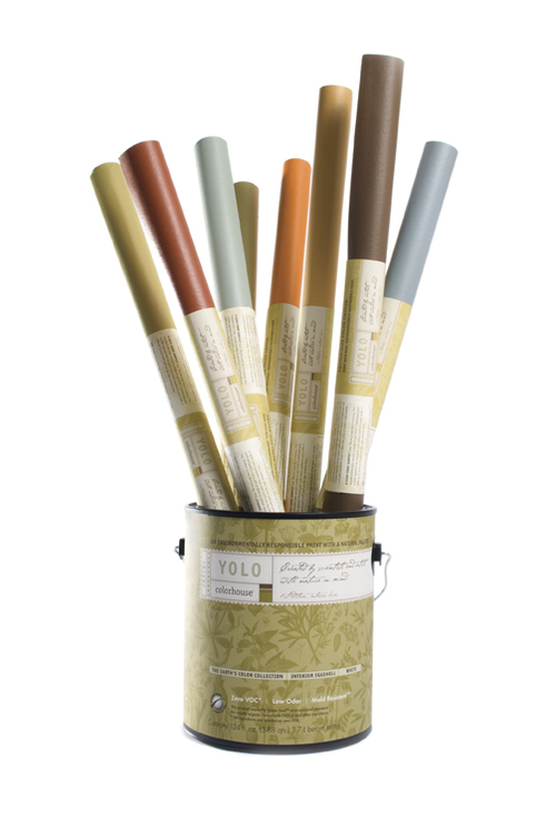
The design of their paint tubs (made from 70% recycled plastic!) is elegant, sophisticated and refined. I think that my client would be happy with something quite similar to this, as the design makes the paints look premium. The design's background is made up of botanical imagery, which relates their brand back to the environmental issues they stand for. By including imagery relating to nature, especially of plant life, the viewer is unconsciously aware – without even thinking too much on the design - that this brand relates to the environment and is doing good things for it. However, I like how the botanical imagery is subtle, not screaming, “We are good for the environment!” This gives the design more sophistication, suitable for a premium paint brand.
The paint tubs contain colours that are subtle and calm (the blue and the olive) and bright and clean (the pink and orange). I think that the blue and olive colours are more suited to a premium brand of paint, while the warm, clean colours of all these colours suit a environmentally-friendly product. 

The company's logo and adjoining label is also quite subtle. The typeface is actually quite small, not taking up the whole of the paint tub and therefore letting the background pattern do most of the talking. Their labels are 100% post-consumer waste labels with soy based inks. Handles have also been added to the tubs to make transportation easier.

 The brand also produces paint that is suitable for children to use. The design makes the most of soft, muted colours. Seen below:

---

Kristin Agnarsdottir - Knoll Lumiere

This paint was designed by Kristin Agnarsdottir as part of her university project. The design is simplistic, with only three colours being used: orange, grey and white. The orange is vivid and rich in colour, meaning that it would stand out on a shelf. The grey and white reins the colour back in, however, stopping it from becoming too much. Typography plays a large part in this design, with the brand name taking up half the area on each tub. The attractive sans-serif font is modern and refreshing. 


However, I do think that this design would not be what my client would be looking for, for it looks like a paint brand that would be displayed proudly in Homebase, while my client's paint is premium and for a higher-class audience.

The square handles are said to be inspired by, "Harry Bertoia's 1952 Diamond Chair Base." No information has been added regarding what the paint tin has been made from.

 ---
Beckers Scotte

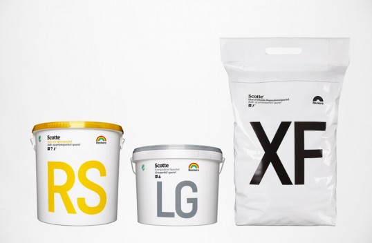
Beckers Scotte is a Swedish paint company. Their paint is free from organic solvents, meaning it is sensitive to allergic environments. 


The different types of paint have been marked with numbers to make the transaction easier to understand for professional painters. Professional painters use terms like “Wall 7” and “Carpentry 70”. This brand has incorporated this into their design. For example, the paint tub “7” is used for indoor walls and ceilings, while the tub marked “3” is designed for mainly for roofs. This makes each packaging easy to locate and use for the professional painter.

Typography plays a large part in this design. Numbers and words are presented in a large sans-serf typeface, which is very easy to read. Therefore, you would be able to spot which paint you need from a distance, when walking over to the store's shelf. Colours are kept minimal; one colour on a white background. Again, this colour scheme adds clarity to the design. 


References: