Showing posts with label primary research. Show all posts

Thursday, 28 November 2013

Materials

As Jo put in his lecture for CAT, “These things are complicated." He went on to say that choosing materials is not as easy as saying that steel, for example, is bad. You have to look at all aspects of that material and work out if it is indeed the best one for the job.

In Jo's presentation, we learned that aluminum used 170 mega jewels of energy to produce - an enormous amount. Cardboard uses 24.2 and plastic uses 90. Jo explained, Generally the more processing the material has, the more energy it takes.”


However, he also explained how production could differ depending on which country you are producing the metal in. For example, in Nigeria it takes 7.5 times as much energy than if you were to make a kilogram of steel in the UK, as UK technology is more advanced. In China, it would take twice as much energy, yet in South Korea and Denmark, it would take half as much energy to create a kilogram than it would in Britain.

I researched further and it was revealed to me that aluminum is 100% recyclable. It can also be melted down and reformed without losing any quality and this process can be repeated again and again. In fact, recycling 1 ton of aluminum saves 9 tons of CO2 emissions. So although aluminum is actually one of the most costly (on the environment too) metals to produce, recycled aluminum is actually very good. Aluminum is a very versatile metal and very light (a third of steel's weight).

When researching into what materials would be good for paint containers, I came across the metal tinplate. This metal is resistant to different temperatures, impervious to light, gas and diffusion, is strong and light and is good for protecting products. I came across the company Huber packaging and they use this metal in the packaging of their paints. For water-based products, they use cans that are lacquered on the inside. They explain, "The interior lacquer prevents the content from coming into direct contact with the tinplate and the welded seam is protected by a powder striping."


I also found that tinplate containers are reusable. In fact, they are endlessly recyclable. They do not degrade each time they are recycled like glass, paper and plastic. Another benefit of using tinplate is a reduced Carbon footprint and a saving of approximately 75% of energy consumption. I think this is a metal I would definitely consider using when designing my packaging.

Tuesday, 26 November 2013

CAT (Blog Task)

1. Had you heard of CAT before you came on the module? If 'yes' then please give an idea where you'd heard about them.

No, I hadn't heard of CAT before our visit.


2. Please give your thoughts on the 3x most notable points raised in the sustainability lecture on site. For example it could be methods of reducing CO2 discussed, the varying views of the 'future' given the issues of oil and climate change or maybe the idea of 'real worth' with materials and artifacts (i.e. remember Jo explaining that one torch would appear to be the most sustainable but in practice another was simpler and more effective).


  • I thought it was definitely an eyeopener when Jo said that one their goals at CAT was to achieve a 100% cut of carbon emissions, which would address all parts of society. This seemed highly ambitious to me, yet it also seems to be necessary.

  • I also found it worrying to know that we in Britain were using up more than our fair share of the planet. If everyone behaved as we did, we would need three planets to sustain us. It seems that some cuts would have to be put in place.

  • In regards to this, Jo explained that a lot of countries didn't have a healthy balance. For example, poorer countries were not using up many resources, yet they were also poor places to live. And in Britain and America, living conditions and education were great, yet we were using up too much. Jo explained that Cuba was a country that had the best balance; it wasn't using up too many resources, yet it was still a good place to live in terms of conditions and education. 

  • I also knew that oil was running out, yet I had no idea that metals such as copper had about 40 years left if we continued to use it the way we were, while led and zinc have only about 20 years left.

3. Please give your thoughts on the 3x most notable things picked-up while at CAT (i.e. it could be one of the specific exhibits seen, their self sufficiency with solar etc and/or maybe the clever use of materials with specific buildings to help reduce CO2 etc).

  • I was interested in the alternative materials they used to keep their buildings running smoothly. Like using sheep wool as insulation, for example.

  • There was also a house that you could look around and throughout its different rooms there was information explaining how you could make your home more energy efficient. 
     
  • They had installed an electricity-generating photovoltaic (PV) roof and next to it they had a panel to show how much energy it was generating at the moment (600 watts when we visited), how much it had generated since installation (61566 kWh) and how much Greenhouse Gas emission had been saved (35092 kg).


4. Now you've had time to reflect, what 3x things gained from the CAT visit might you bring forward into your ideas and developments for the sustainable packaging brief?

  • Thinking of what materials would be the best to use for project. For example, I learned that some metals take more energy to produce than others.

  • I was also inspired to experiment more with different materials, those that might not seem as obvious for the job.

  • Making sure my packaging is energy efficient and doing its bit toward helping the environment.

Sunday, 24 November 2013

Farrow & Ball & ECOS Organic Paints: Futher Designs

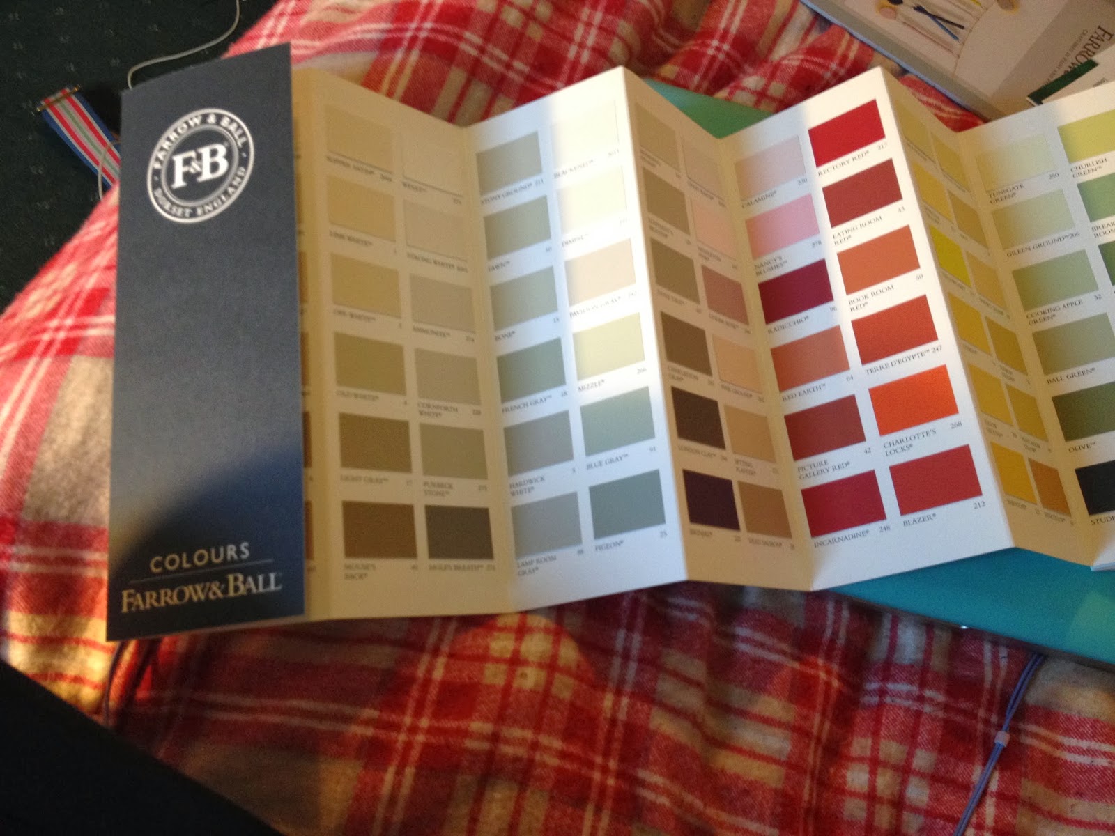
I ordered colour swatches from my clients competitors to get a better idea about the graphic design of their companies.

Farrow & Ball definitely has a sleek, professional look that is carried through on their colour swatch and their promotional leaflets. There is something very aesthetically pleasing about the long, thin colour swatch, the front which contains only two colour (white and a very dark navy blue) and their logo. It looks incredibly sophisticated.

Their promotional leaflet, meanwhile, shows rich architecture and furniture, clearly marking who their intended audience is. I think that it might be fun to experiment with the design of typical markings seen on ornate wallpapers and architecture; perhaps this could be a pattern to take forward in my own design.

ECOS mimics the Farrow & Ball colour swatch, in that both designs are the same tall, thin size, use a minimal amount of colour and display only their logo on the front. However, ECOS Organic Paints seems a lot friendlier somehow, perhaps in the light use of colour - and yet I think a certain air of sophistication is lost, especially on the back pages. I think it their use of sans-serif typefaces, while Farrow & Ball uses serif; it just seems more traditional and elegant.


FARROW & BALL


ECOS ORGANIC PAINTS


COMPARISON
Back pages. Farrow & Ball (Left) - ECOS (Right)
Information on back. Farrow & Ball (top) - ECOS (bottom)
Front pages.

Sunday, 17 November 2013

CAT Visit

We took one of our lecture times to visit The Centre for Alternative Technology (CAT) in wales. Once we arrived, we were given a short presentation, where we were told about CAT's past, what it currently did and the reason why it was set up.


We learned that CAT had been running since 1973. During the 70's people feared for a third world war and began to realise that supplies would eventually run out. Fossil fuels would not be around forever and the world was using too much oil. Influential books were also published during this era, such as Silent Spring by Rachel Carson, which describes how DDT (a pesticide) enters the food chain and accumulates in the fatty tissues of animals - including human beings. Suddenly, people were more concerned about environmental issues than they ever had been before. CAT founded their site during this time to promote sustainable alternatives.

Jo Gwillim joked in his presentation that CAT was a "museum of mistakes". He said that they had learn by doing what alternative materials were successful and which were not. Most notable was when CAT decided to build one of their buildings from timbre, a good natural material. However, it takes a lot of energy to dry timbre and so they they decided to use the timbre without drying it, in order to save energy. Yet when the timbre eventually dried, it shrunk and changed shape, resulting in a cracked roof! Jo also said that they had used wool (a natural material) to insulate the walls of their building. Yet when it rained, water got into the wool, causing it to dampen, which made the entire building smell of dead sheep! Lovely. So CAT have had to learn from their mistakes through experimentation and seem to be doing this a lot more successfully now.

At the moment, CAT runs courses and provides educational insight into sustainability and helping the environment. It has turned from an experimental place into an educational place. One of their goals is to help achieve a 100% cut of carbon emissions, which will address all parts of society.

After the talk, we explored the grounds.

A large wind turbine found on the site! This is certainly different to your traditional windmill yet seemed to be working just as successfully.

Solar panels had been used on various buildings around the site. This was actually a electricity-generating photovoltaic (PV) roof. The left hand side was installed in 1997 and the right hand side in 2007. The individual panels are not sitting on the roof - they actually are the roof! This saves material and cost. A sign nearby showed: 1) How much energy it was currently generating, 2) How much energy had been generated since October 2006 and 3) Greenhouse Gas emission saved. Seen below:
These results were definitely an eye opener.

An innovative use of material (above). These coloured pencils were made of simple, thick twigs. The production of the pencils is therefore much lower and quicker, which saves energy. I think that they look quite attractive too, especially when tied in bundles.

Another innovative use of material were these socks, which were made out of bamboo! This was something I had never even considered possible, so these were interesting to view. They felt like high-quality socks.

This display showed rockwool, which is cheaper and better suited to places that could get damp like sheep's wool. The sign explains by insulating your conservatory this conserves energy. 

Unique transportation up to the site.

Map of site.

Interior of shop. All the products found in the shop were eco-friendly and unique in appearance. It was fun looking at innovative use of materials I would have never thought of before.

The most curious thing I saw! At first I wasn't sure what this is. When I read the sign is explained that this was a hub (the bit the blades are attached to) from an NM72 wind turbine. When the 35 m blades are attached, this has a rotor diameter of 72 metres and the output from a turbine of this size would be 2.75 megawatts.


References:
http://www.cat.org.uk/index.html
http://www.nrdc.org/health/pesticides/hcarson.asp

Wednesday, 6 November 2013

Packaging Ideas

BrandImage's 360 Degree Paper Bottle 
Working to solve the problem of plastic bottles – 86% of them will find their way into landfill – BrandImage produced the paper bottle. Dubbed the 360 degree bottle, it is moulded entirely out of recycled, food-safe paper and has won the IDEA (International Design Excellence Award) award. It has not yet been put into production, but its simplistic design, eco-friendly nature and how it can be packaged in multiples efficiently means that it could do well on the shelf.


However, I am a bit unsure of the aesthetics of the bottle. Though they can be purchased in different colours, I am not sure that it would stand out on a shelf or its design would encourage a customer (who perhaps didn't know of its virtues) to pick it up. 
 ---

Ivan Maximov's Take-Away Beer Packaging
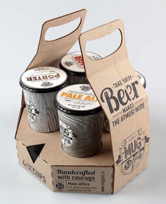
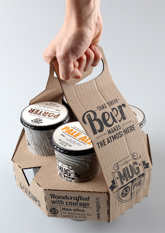
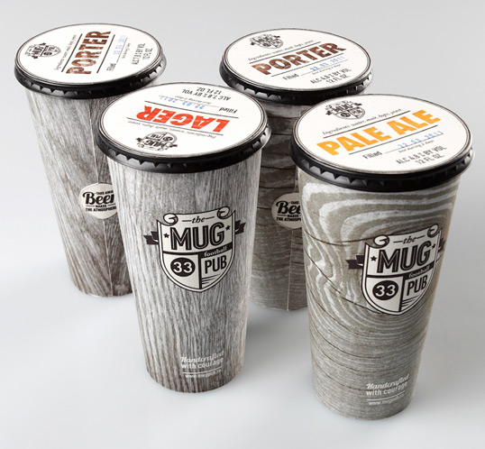
Ivan Maximov developed concept packaging for the Mug Pub. He explains, “Mug is a big chain of football pubs based in Moscow.” His new concept is take-away beer. I was interested in this design for the cups are packaged in multiples and can be easily transported by hand. Since packaging in multiplies is something that I have to consider in my brief, I found looking at Maximov's design very helpful.


The outer packaging is made from cardboard. At its base, circular shapes have been cut out, making room for the four cups that it will transport. These cups seemed to be nestled tightly into the packaging, yet they will still have to be handled with care. They would not survive the back of a van, nor are they designed for that purpose. I would therefore have to create a more secure packaging for paint tins, though perhaps this idea is a good starting point. 

---

Tetra Pak 

Using Tetra Pak for the packaging of paint is also a consideration. A lot of companies have moved to packaging drinks in Tetra Pak containers, for they are more eco-friendly, as they can be recycled and be made out of recycled material.

Vivid Water:

 Yellow + Blue Wine:

M&S Milk:

Different sizes and shapes of Tetra Pak containers can be seen here: http://productxplorer.tetrapak.com/en/packages-by-volume

However, I contacted Tetrapak.com asking if it would be possible to contain paint in Tetra Pak containers. This was the reply that I received:

Dear Martha
Thank you for contacting us
The materials on our cartons consists of layers of paper, polyethylene and aluminum (for the aseptic cartons) see

As you can see the inside of the carton is covered with a thin layer of polyethylene (to seal in the liquid and protect the product from external moisture)
The packaging material is formed to cartons inside the filling machine. As you can see it would not be possible to store paint inside Tetra Pak cartons during the filling process.


References: 
http://www.thegrocer.co.uk/fmcg/vivid-water-claims-a-tetra-pak-first/348490.article
http://www.packagingnews.co.uk/news/ms-launches-first-long-life-milk-range-in-tetra-pak-cartons/  
http://designstamped.com/2011/01/27/great-packaging-design/
http://gizmodo.com/5099105/eco+friendly-360-paper-bottle-concept-makes-tetra-paks-look-so-60s 
http://www.dieline.com/
http://designstamped.com/wp-content/uploads/2011/01/BEST-PACKAGING-DESIGN.bmp
http://lovelypackage.com/student-work-ivan-maximov/