Showing posts with label target audience. Show all posts

Friday, 20 December 2013

Flower Pot Pattern: Wallpaper Inspiration

As mentioned in my previous blog post and seen in my Learning Journal, I have decided to design my paint container so that it can be reused as a flower pot. Shown in my designs, a label would be wrapped about the aluminum paint container, clear and simplistic, showing the brand identity and crucial information for the decorator's (as the target audience are likely to hire one) benefit. This label could then be removed after use, to reveal an attractive pattern, printed onto the metal container, so that it could be used as an aesthetically-pleasing flower pot. I mentioned in the linked blog post that the pattern seen on the metal would have to be sophisticated and premium in appearance to attract my target audience. I therefore looked at patterns seen on high-end wallpapers for design inspiration.

Sophisticated, repetitive patterns. One strong, bold colour against a plainer cream backdrop.
Shown above is wallpaper by Edward Bulmer's main competitor, Farrow & Ball. I therefore think that this is the kind of sophisticated patterns that Edward Bulmer would like, as the client expressed his admiration for Farrow & Ball's overall design during the client meeting. I also feel I am therefore on track with this research.
Floral inspiration on patterns. This would work well on a flower pot, the pattern linking to nature.


I also looked at Harlequin, a website that I found advertised in the Country Homes & Interiors magazine during my inspiration search, a magazine that my target audience is theorized to read.

The following wallpaper patterns were found on Harlequin's website:
Harlequin


These wallpapers I looked at were premium, ranging from £49 to £116 in price. They are designed for the same target audience who I am looking into.

Their patterns have obviously been influenced from traditional wallpaper designs. They are repetitive, intricate, subtle and made up of no more than three colours. Most colours used are not particularly vivid (with some exceptions) but rather use soft, complimentary tones. I felt like the patterns that were influenced by floral and botanic imagery could be especially fitting for the purpose of my designs.


References:
http://www.tangletree-interiors.co.uk/
http://www.harlequin.uk.com/harlequin-wallpaper.aspx

Monday, 9 December 2013

Reusing Paint Containers

If packaging has a secondary use after its primary function has finished, this also avoids wastage. For further research, I looked into what people are currently reusing paint containers for, searching for inspiration.

Martha Stewart shows on her website how to reuse paint containers as cubbyholes, something to store your pens, papers etc. in. Perhaps if the exterior of the paint container was decorated fashionable, this could be something that my target audience would be interested in.
See more here: http://www.marthastewart.com/272668/paint-can-cubbies

I also found an example of people reusing old paint tins as bird feeders. This is a fun idea and promotes a environmentally-friendly image of the company.

Another example that kept appearing was how to turn your paint container into a flower pot. Laurel shows on her blog how to transform an average paint container into an attractive flower pot, simply by adding wrapping paper around its outside.
This is a fairly simplistic idea that would be easy to adopt. It would also promote the environmentally-friendly nature of the Edward Bulmer company, as it links the paint to plant-life. It encourages the user to plant a seed after their paint is used, encouraging a better environment. It also says something about the paint if the container can be used to grow a seed once the paint is gone. It reinforces the natural, friendly ingredients of the paint, though it would seem likely to clean the container out first.

The exterior of the paint would therefore have to have an attractive label for this idea to work. My target audience, especially, would not simply want to plant flowers in a simple, plain aluminum container, as it looks cheap. However, with a sophisticated and attractive exterior, I feel like they will be encouraged to reuse the packaging for this reason. If they don't want to reuse the paint container, then it can always be recycled. There is no harm done, yet this could be an incentive for them to make use of reusing products.

Bronwyn Hayes also uses a similar technique on her blog with turning old tin cans into flower pots. She uses fabrics, paints and buttons to achieve this attractive result. She also attaches string to the tins so that she can hang the flowers. See Bronwyn's magazine: http://www.red-brolly.com/photos/red_brolly_books/

I found another example on Kate's blog, who transformed old paint containers into a pot for storing herbs. She decorated the containers using soft, muted colours.

Something that I considered was if my target audience would bother to garden, especially if they are likely to hire a decorator for painting rooms. However, I feel like gardening is certainly a more middle-class hobby and something that they could take an interest in. The blogs of the people I looked at who were finding ways to reuse old paint containers were all women, sophisticated and obviously into arts and crafts. And when you think that my target audience "goes to all the glossy magazines for inspiration" (see previous blog post), looking at magazines such as Country Homes & Interiors (also see previous blog post), it is likely that they will be interested in this concept. The target audience was also described as "middle aged to retired homeowners" and these are usually the people who take interest in similar small arts and crafts projects. 

"For me it has to be classical, I love antiques and traditional colour schemes compliment them beautifully." This was also said in the key costumer insight, so if I went with this idea I think I would have to produce a elegant label to be able to pull the concept off.

I found on Country Living (a magazine my target audience is guessed to read) other ideas of reusing materials, which reconfirmed my theory that this idea was suitable for my audience.  They showed how to reuse soup cans, by turning them into small flower pots and pots to store cutlery in when entertaining! Seen below:


Here are other reuses for old paint containers, or similar shaped cans, that I found:


References:
http://www.marthastewart.com/272668/paint-can-cubbies
http://www.ducksinarowblog.com/2009/12/paperwhites-easy-gift.html
http://www.red-brolly.com/red-brolly/2013/04/upcycle-everything-old-is-new-again-turning-old-tin-cans-into-flower-pots.html
http://www.centsationalgirl.com/2012/03/cottage-screen-door-planter-rack/
http://www.sodahead.com/united-states/kindred-spirits/group-22601/do-it-yourself-projects/forum-54379/how-to-make-a-paint-can-bird-feeder/discussion-801029/?link=ibaf&q=&esrc=s
http://edge.moofgroup.com/edged/?q=node/74
http://www.thesweetestoccasion.com/2009/10/pretty-party-inspiration-country-living-entertaining-ideas/
http://www.squidoo.com/Reuse-Recyle-Repurpose-Cans
http://earth911.com/news/2012/10/22/10-simple-reuse-projects-in-30-minutes-or-less/2
http://www.thethriftinessmiss.com/2012/10/the-tin-can-candy-buffett.html
http://www.diyinspired.com/5-clever-ways-reuse-tin-aluminum-cans/

Monday, 18 November 2013

Creative Brand Identities (2)

YOLO Colorhouse

YOLO Colorhouse is brand of paints that also looks to be environmentally-friendly. You can see their thoughts on VOC's here: http://www.yolocolorhouse.com/learn-home/zero-and-low-voc-paint/
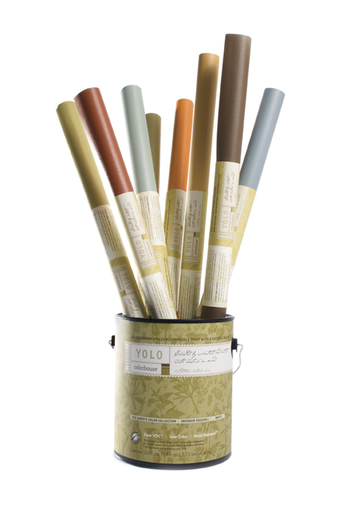
The design of their paint tubs (made from 70% recycled plastic!) is elegant, sophisticated and refined. I think that my client would be happy with something quite similar to this, as the design makes the paints look premium. The design's background is made up of botanical imagery, which relates their brand back to the environmental issues they stand for. By including imagery relating to nature, especially of plant life, the viewer is unconsciously aware – without even thinking too much on the design - that this brand relates to the environment and is doing good things for it. However, I like how the botanical imagery is subtle, not screaming, “We are good for the environment!” This gives the design more sophistication, suitable for a premium paint brand.
The paint tubs contain colours that are subtle and calm (the blue and the olive) and bright and clean (the pink and orange). I think that the blue and olive colours are more suited to a premium brand of paint, while the warm, clean colours of all these colours suit a environmentally-friendly product. 

The company's logo and adjoining label is also quite subtle. The typeface is actually quite small, not taking up the whole of the paint tub and therefore letting the background pattern do most of the talking. Their labels are 100% post-consumer waste labels with soy based inks. Handles have also been added to the tubs to make transportation easier.

 The brand also produces paint that is suitable for children to use. The design makes the most of soft, muted colours. Seen below:

---

Kristin Agnarsdottir - Knoll Lumiere

This paint was designed by Kristin Agnarsdottir as part of her university project. The design is simplistic, with only three colours being used: orange, grey and white. The orange is vivid and rich in colour, meaning that it would stand out on a shelf. The grey and white reins the colour back in, however, stopping it from becoming too much. Typography plays a large part in this design, with the brand name taking up half the area on each tub. The attractive sans-serif font is modern and refreshing. 


However, I do think that this design would not be what my client would be looking for, for it looks like a paint brand that would be displayed proudly in Homebase, while my client's paint is premium and for a higher-class audience.

The square handles are said to be inspired by, "Harry Bertoia's 1952 Diamond Chair Base." No information has been added regarding what the paint tin has been made from.

 ---
Beckers Scotte

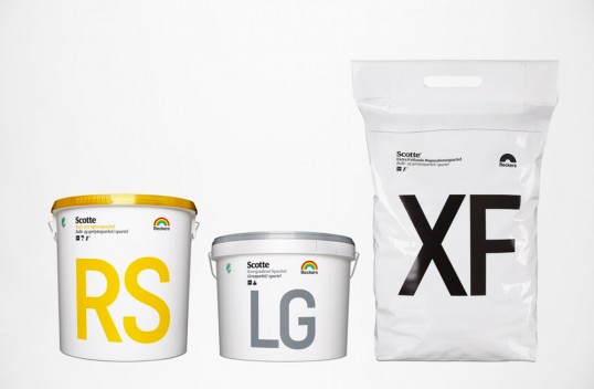
Beckers Scotte is a Swedish paint company. Their paint is free from organic solvents, meaning it is sensitive to allergic environments. 


The different types of paint have been marked with numbers to make the transaction easier to understand for professional painters. Professional painters use terms like “Wall 7” and “Carpentry 70”. This brand has incorporated this into their design. For example, the paint tub “7” is used for indoor walls and ceilings, while the tub marked “3” is designed for mainly for roofs. This makes each packaging easy to locate and use for the professional painter.

Typography plays a large part in this design. Numbers and words are presented in a large sans-serf typeface, which is very easy to read. Therefore, you would be able to spot which paint you need from a distance, when walking over to the store's shelf. Colours are kept minimal; one colour on a white background. Again, this colour scheme adds clarity to the design. 


References: