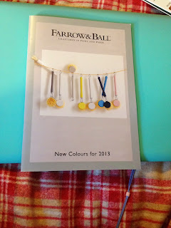
Farrow & Ball definitely has a sleek, professional look that is carried through on their colour swatch and their promotional leaflets. There is something very aesthetically pleasing about the long, thin colour swatch, the front which contains only two colour (white and a very dark navy blue) and their logo. It looks incredibly sophisticated.
Their promotional leaflet, meanwhile, shows rich architecture and furniture, clearly marking who their intended audience is. I think that it might be fun to experiment with the design of typical markings seen on ornate wallpapers and architecture; perhaps this could be a pattern to take forward in my own design.
ECOS mimics the Farrow & Ball colour swatch, in that both designs are the same tall, thin size, use a minimal amount of colour and display only their logo on the front. However, ECOS Organic Paints seems a lot friendlier somehow, perhaps in the light use of colour - and yet I think a certain air of sophistication is lost, especially on the back pages. I think it their use of sans-serif typefaces, while Farrow & Ball uses serif; it just seems more traditional and elegant.
FARROW & BALL
ECOS ORGANIC PAINTS
COMPARISON
Back pages. Farrow & Ball (Left) - ECOS (Right)
Information on back. Farrow & Ball (top) - ECOS (bottom)
Front pages.


No comments:
Post a Comment