Showing posts with label creative brand identities. Show all posts

Sunday, 8 December 2013

Creative Brand Identities (4)

Hempel
Marnich Associates recently designed a new packaging for a paint company named Hempel. Their previous design had an outdated feel, which Marnich Associates modernised.Their design uses a sleek and sophisticated monochrome palette, with a splash of colour, running through different tones, at the top. A traditional paint shape and handle has been kept in use.


 ---

Chroma Paint
Stephanie Kuga designed packaging for Chroma Paint, an environment conscious line of interior home paints, during her study at university. I was particularly interested in this design due to its eco-friendly image. The exterior of the packaging is created from cardboard and is easily collapsible for recycling purposes. The shapes stray from the traditional, appearing more square and rectangular, and look wholly unique. The interior has a plastic lining, to keep the paint safe and make sure that its chemicals are securely contained, and this is the only waste generated from this container. The logo is written in a bold, legible font on the cardboard, while a label wraps around the packaging to display additional information. Soft, organic colours add to this eco-friendly appearance.


The overall feel of the packaging definitely hints at being environmentally friendly, yet I am unsure if it also looks premium. It does look sleek and sophisticated, though it is very far more traditional. Therefore, I don't think it would be wholly appropriate for my target audience. 
 ---


Orchard Supply Hardware (OSH)
Another student project, this one by Thanyaluck Keawkingkeo, was for Orchard Supply Hardware (OSH). This company was originally formed in 1931 by thirty farmers. The company is also seen as a green, environmentally-friendly brand and Keawkingkeo reflects this in her designs. A large plant emits from the paintbrush, seen on the front of the paint container, linking both paint (their product) and the environment (their consideration). OSH also supporst Farmaid, a non-profit organization that protects and supports family farmers in America. A farmyard theme has been used throughout the design to symbolise this. The colours work extremely effectively together, making the product look fresh and inviting, while also keeping a hint of the farmyard (the yellow looks like the colour of corn). A traditional paint container shape has been used, yet the design stops it from appearing anywhere near bland. The paint container looks premium, though maintains a quirky feel.

---

Dutch Boy
Again, another student design, this by Neha Hattangdi.
Dutch Boy was founded in 1907. Lawrence C. Earle, a famous artist, painted the original logo, which remains an icon for the company even today. The logo is of a boy wearing overalls, Dutch wooden clogs and carrying a paintbrush and bucket. Hattangdi keeps this familiar logo in her design, seen largely on the front of the container. Years ago, the Dutch boy also featured in colouring books. Taking inspiration from this, Hattangdi decided to create a storyworld for the Dutch boy to live in. She created this through beautiful illustrations seen on the back of the containers. Hattangdi writes, "When a number of cans are lined up next to each other, they create a unique shelf-experience, and give us a glimpse of the world Dutch Boy lives in."
The use of colour is extremely subtle and adds to the premium feel, as do the sophisticated illustrations. This is an extremely fun paint container, which works as a story and still manages to be very subtle and elegant.
---
Milk
Darren Custance created unusual new packaging for the milk bottle. I was immediately struck by this bold, sophisticated design. The card packaging presents a environmentally-friendly appearance and the strong, graphical image of the milk bottle adds elegance. The bright white colour of the milk also compliments the brown of the card and makes the packaging stand out more vividly. The design is simple, with no added frills, yet I think this is why it works so well. A handle has also been included, to ease transportation.

Wine
Wine glasses can be an annoyance to pack, for they extremely delicate and without packaging to keep them in place they can be easily smashed. However, using a massive amount of packaging to do so is nowhere near eco-friendly. Fortunately a concept has been created to avoid this, designed by Joona Louhi. The target audience were young adults who were used to moving around a lot, perhaps because of studying. 


After this elegant packaging has served its primary function, it can be reused as a wine rack for three bottles.


References:  

Monday, 18 November 2013

Creative Brand Identities (3)

Belco Paint

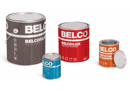
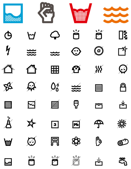
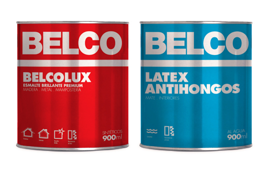
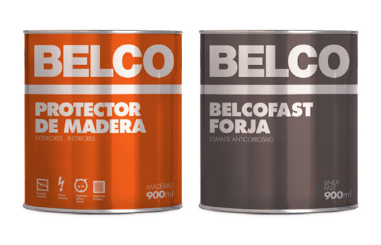
This is a design for Belco Paint by Atolรณn de Mororoa from Uruguay. The project involved redesigning four lines of products and bringing them up to date. To achieve this Mororoa created a colour identification system. To highlight the properties of each product they also created numerous icons, to symbolise different properties. 
 
The design is very simplistic, with little more than typography being used. Yet the texture of the background gives the label a shiny appearance, which immediately attracted me, as it adds another dimension to a otherwise flat label.

The shape of the tins I have been looked at all seem consistently like this one, both in height, width and the inclusion of handles. I think this is the type of tin people feel comfortable with when it comes to paint. Immediately, by using this type of container, the paint is trustable and appears of high quality. 


Trixol
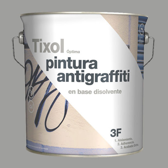
The paint company Tixol created a range of white insulating treatments with different finishes. The solution was designed by Eduardo del Fraile from Spain.

The concept of the background of this design was to represent the action of the paint once it had been used over different backgrounds. The diagonal white line represents the final finish of the product. This is getting the message across that this is a powerful paint that will cover your walls easily, no matter of what is currently on them.

Again, there is use of simplistic sans-serif typography, which I am seeing a lot of as I research into these creative ideas for paint packaging. I definitely think the use of this typeface makes the packaging appear fresh and modern, which reflects well on the paint itself.

Back:

Colorcril
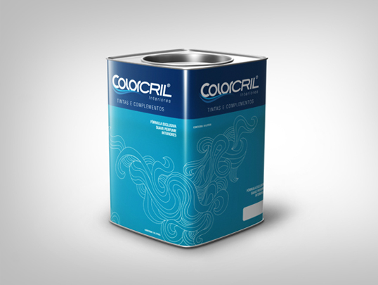
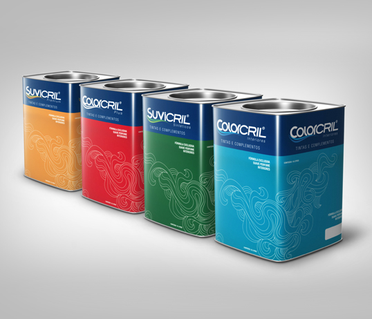
This was designed by Mariella Leal from Brazil for the company Colorcril. The colour of the tin is the same colour as the paint that is inside. I was particularly interested in the shape of this tin, for it was square, not like the rounded paint tins I am used to seeing. However, I think this would make the product stand out amongst its competitors and it gives the paint a more creative edge. The design of the tin is simplistic; it lets the colour do the talking. A white pattern is placed over the colour to add that extra flourish of detail. It looks almost like a wave to me. 


Steen-Hansen

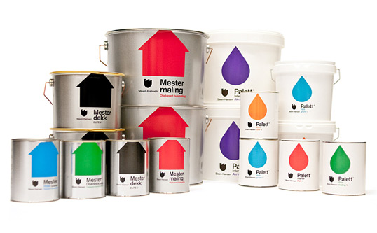
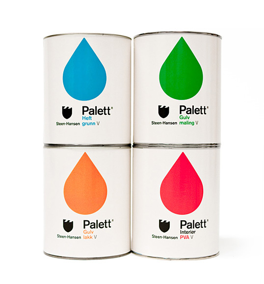
This design was created by Kleivan Schnitler for one of the oldest paint factories in Norway, Steen-Hansen. The vibrant colours will certainly make the design stand out on a shelf. I would personally like to see what the packaging would look like with a black background - for some reason white backgrounds tend to say “cheap”, perhaps this is because white backgrounds are always in use on the design of the store's cheap personal brand. Though, at the same time, perhaps the bright colours would not 'pop' as much on a background that wasn't as neutral as white.

The packaging for these products have made from plastic and metal. This seems like the go-to materials of paint packaging, which I have discovered through this research. However, are they the best environmentally-friendly materials? 


References: 
http://lovelypackage.com/belco/#more-20607 
http://thegrid.soup.io/tag/Paint
http://www.tixol.es/


Creative Brand Identities (2)

YOLO Colorhouse

YOLO Colorhouse is brand of paints that also looks to be environmentally-friendly. You can see their thoughts on VOC's here: http://www.yolocolorhouse.com/learn-home/zero-and-low-voc-paint/
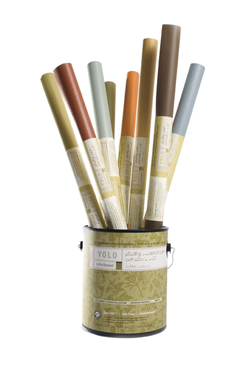
The design of their paint tubs (made from 70% recycled plastic!) is elegant, sophisticated and refined. I think that my client would be happy with something quite similar to this, as the design makes the paints look premium. The design's background is made up of botanical imagery, which relates their brand back to the environmental issues they stand for. By including imagery relating to nature, especially of plant life, the viewer is unconsciously aware – without even thinking too much on the design - that this brand relates to the environment and is doing good things for it. However, I like how the botanical imagery is subtle, not screaming, “We are good for the environment!” This gives the design more sophistication, suitable for a premium paint brand.
The paint tubs contain colours that are subtle and calm (the blue and the olive) and bright and clean (the pink and orange). I think that the blue and olive colours are more suited to a premium brand of paint, while the warm, clean colours of all these colours suit a environmentally-friendly product. 

The company's logo and adjoining label is also quite subtle. The typeface is actually quite small, not taking up the whole of the paint tub and therefore letting the background pattern do most of the talking. Their labels are 100% post-consumer waste labels with soy based inks. Handles have also been added to the tubs to make transportation easier.

 The brand also produces paint that is suitable for children to use. The design makes the most of soft, muted colours. Seen below:

---

Kristin Agnarsdottir - Knoll Lumiere

This paint was designed by Kristin Agnarsdottir as part of her university project. The design is simplistic, with only three colours being used: orange, grey and white. The orange is vivid and rich in colour, meaning that it would stand out on a shelf. The grey and white reins the colour back in, however, stopping it from becoming too much. Typography plays a large part in this design, with the brand name taking up half the area on each tub. The attractive sans-serif font is modern and refreshing. 


However, I do think that this design would not be what my client would be looking for, for it looks like a paint brand that would be displayed proudly in Homebase, while my client's paint is premium and for a higher-class audience.

The square handles are said to be inspired by, "Harry Bertoia's 1952 Diamond Chair Base." No information has been added regarding what the paint tin has been made from.

 ---
Beckers Scotte

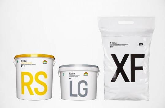
Beckers Scotte is a Swedish paint company. Their paint is free from organic solvents, meaning it is sensitive to allergic environments. 


The different types of paint have been marked with numbers to make the transaction easier to understand for professional painters. Professional painters use terms like “Wall 7” and “Carpentry 70”. This brand has incorporated this into their design. For example, the paint tub “7” is used for indoor walls and ceilings, while the tub marked “3” is designed for mainly for roofs. This makes each packaging easy to locate and use for the professional painter.

Typography plays a large part in this design. Numbers and words are presented in a large sans-serf typeface, which is very easy to read. Therefore, you would be able to spot which paint you need from a distance, when walking over to the store's shelf. Colours are kept minimal; one colour on a white background. Again, this colour scheme adds clarity to the design. 


References:
 

Friday, 15 November 2013

Creative Brand Identities (1)

Trommler Paints by Reynolds and Reyner

When Waldo Trommler Paints, a Finnish brand of paints, was rebranded by Reynolds and Reyner, the designers took the clients goal for “standing out at all costs” seriously. The brand identity is minimal, with no set colour. Reynolds and Reyner explained, “We needed to find the design solution that hadn't been used by any of the competitors. At the same time showing the main features of the company – friendliness, quality and innovation.” Each item they designed is bright and friendly. For the paint tin, typography played a major role and is displayed large and proud, taking up most of the space for the packaging. Colours are contrasting, grabbing the viewer's attention with their vibrancy. 


This is perhaps a more fun take on paint packaging than what the Edward Bulmer brand would demand, yet I found it interesting and helpful to take a step back, look at paint packaging more broadly, and see what other strong designers were doing successfully. 

Further brand idenity:


Russel Wright Paints by Adam Mulyadi (Premium Paint)
This paint packaging design was created by student Adam Mulyadi. Russel Wright is a famous pottery maker, so Mulyadi took inspiration from the vintage look of his pottery work, while also matching the colours of the paint with Wright's dinnerware. Seen below:
I was particularly interested in this design because it was designed for premium paint, which is what the Edward Bulmer paint is. Mulyadi's soft, muted colours give that sophisticated edge, as does the sleek typography and no-fuss design. However, I am not sure about the checked pattern, which would possibly look better on a cheaper brand name. The overall appearance of the design is very polished and sleek. A handle is also added for easier transportation.


References
http://www.thedieline.com/blog/2009/8/14/student-spotlight-russel-wright-paint.html
http://www.coroflot.com/adammulyadi/russel-wright-paint-print
http://www.thedieline.com/blog/2012/6/26/waldo-trommler-paints.html