Sunday, 17 November 2013

CAT Visit

We took one of our lecture times to visit The Centre for Alternative Technology (CAT) in wales. Once we arrived, we were given a short presentation, where we were told about CAT's past, what it currently did and the reason why it was set up.


We learned that CAT had been running since 1973. During the 70's people feared for a third world war and began to realise that supplies would eventually run out. Fossil fuels would not be around forever and the world was using too much oil. Influential books were also published during this era, such as Silent Spring by Rachel Carson, which describes how DDT (a pesticide) enters the food chain and accumulates in the fatty tissues of animals - including human beings. Suddenly, people were more concerned about environmental issues than they ever had been before. CAT founded their site during this time to promote sustainable alternatives.

Jo Gwillim joked in his presentation that CAT was a "museum of mistakes". He said that they had learn by doing what alternative materials were successful and which were not. Most notable was when CAT decided to build one of their buildings from timbre, a good natural material. However, it takes a lot of energy to dry timbre and so they they decided to use the timbre without drying it, in order to save energy. Yet when the timbre eventually dried, it shrunk and changed shape, resulting in a cracked roof! Jo also said that they had used wool (a natural material) to insulate the walls of their building. Yet when it rained, water got into the wool, causing it to dampen, which made the entire building smell of dead sheep! Lovely. So CAT have had to learn from their mistakes through experimentation and seem to be doing this a lot more successfully now.

At the moment, CAT runs courses and provides educational insight into sustainability and helping the environment. It has turned from an experimental place into an educational place. One of their goals is to help achieve a 100% cut of carbon emissions, which will address all parts of society.

After the talk, we explored the grounds.

A large wind turbine found on the site! This is certainly different to your traditional windmill yet seemed to be working just as successfully.

Solar panels had been used on various buildings around the site. This was actually a electricity-generating photovoltaic (PV) roof. The left hand side was installed in 1997 and the right hand side in 2007. The individual panels are not sitting on the roof - they actually are the roof! This saves material and cost. A sign nearby showed: 1) How much energy it was currently generating, 2) How much energy had been generated since October 2006 and 3) Greenhouse Gas emission saved. Seen below:
These results were definitely an eye opener.

An innovative use of material (above). These coloured pencils were made of simple, thick twigs. The production of the pencils is therefore much lower and quicker, which saves energy. I think that they look quite attractive too, especially when tied in bundles.

Another innovative use of material were these socks, which were made out of bamboo! This was something I had never even considered possible, so these were interesting to view. They felt like high-quality socks.

This display showed rockwool, which is cheaper and better suited to places that could get damp like sheep's wool. The sign explains by insulating your conservatory this conserves energy. 

Unique transportation up to the site.

Map of site.

Interior of shop. All the products found in the shop were eco-friendly and unique in appearance. It was fun looking at innovative use of materials I would have never thought of before.

The most curious thing I saw! At first I wasn't sure what this is. When I read the sign is explained that this was a hub (the bit the blades are attached to) from an NM72 wind turbine. When the 35 m blades are attached, this has a rotor diameter of 72 metres and the output from a turbine of this size would be 2.75 megawatts.


References:
http://www.cat.org.uk/index.html
http://www.nrdc.org/health/pesticides/hcarson.asp

Friday, 15 November 2013

Creative Brand Identities (1)

Trommler Paints by Reynolds and Reyner

When Waldo Trommler Paints, a Finnish brand of paints, was rebranded by Reynolds and Reyner, the designers took the clients goal for “standing out at all costs” seriously. The brand identity is minimal, with no set colour. Reynolds and Reyner explained, “We needed to find the design solution that hadn't been used by any of the competitors. At the same time showing the main features of the company – friendliness, quality and innovation.” Each item they designed is bright and friendly. For the paint tin, typography played a major role and is displayed large and proud, taking up most of the space for the packaging. Colours are contrasting, grabbing the viewer's attention with their vibrancy. 


This is perhaps a more fun take on paint packaging than what the Edward Bulmer brand would demand, yet I found it interesting and helpful to take a step back, look at paint packaging more broadly, and see what other strong designers were doing successfully. 

Further brand idenity:


Russel Wright Paints by Adam Mulyadi (Premium Paint)
This paint packaging design was created by student Adam Mulyadi. Russel Wright is a famous pottery maker, so Mulyadi took inspiration from the vintage look of his pottery work, while also matching the colours of the paint with Wright's dinnerware. Seen below:
I was particularly interested in this design because it was designed for premium paint, which is what the Edward Bulmer paint is. Mulyadi's soft, muted colours give that sophisticated edge, as does the sleek typography and no-fuss design. However, I am not sure about the checked pattern, which would possibly look better on a cheaper brand name. The overall appearance of the design is very polished and sleek. A handle is also added for easier transportation.


References
http://www.thedieline.com/blog/2009/8/14/student-spotlight-russel-wright-paint.html
http://www.coroflot.com/adammulyadi/russel-wright-paint-print
http://www.thedieline.com/blog/2012/6/26/waldo-trommler-paints.html 

Similar Companies

Farrow and Ball

Our client listed Farrow and Ball as their main competitor and so I decided to look further into this paint company, for their style and branding is very similar to Edward Bulmer: Pots of Paint.


On the Farrow and Ball website it says that their paints are produced in Dorset, England. Their paints are eco-friendly, with low or minimal VOC content. They are also water-based, which means they do not contain a very strong smell. The company's target audience is for a higher class of people who are also likely to hire a decorator, the same as with Edward Bulmer. 


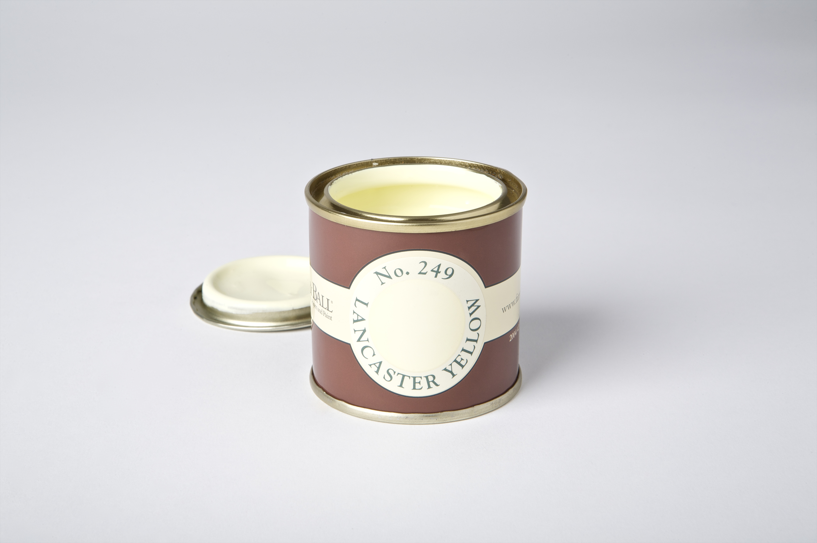
Their paint tins are simplistic in that there is not too much going on. A white band wraps around the dark red tin, showing the logo on the front and the colour swatch on the back. The design looks elegant. With companies such as these, I really think that minimalistic is the key with their designs, for it looks more sophisticated, which will entice the target audience.
Unfortunately, I contacted this company and they did not answer my questions in response. 


ECOS Organic Paint
ECOS created their cans from recycled/recyclable steel 5L UN cans, 1L recyclable polypropylene & polyethylene pots and recycled/recyclable card boxes. They also say that energy usage is kept to a minimum during the packaging's production.

Their design for their cans is very simplistic; their logo has been placed, in a square, on the front of their packaging. The packaging for the larger tin does look bare, perhaps even unfinished. If their logo was larger, so to fit the larger tin, perhaps then it would have that more 'together' appearance. However, it is possible that the company wanted to save ink, which is another thing consideration I would have to take into account. Their tin also contains a handle, which makes transportation easier.


Little Green
Little Greene promotes the indenty of their brand through their packaging by using the dark, rich green seen in their logo and throughout their website.
Their packaging also contains a subtle pattern, which adds dimension and detail to their label, without it becoming too much. The faint outline of this pattern also ensures that their logo can be seen clearly.

The client mentioned that Little Greene's tins were very effective and the most reliable. He explained that their packaging contains thick cardboard inserts, which sit inside the paint tin. This seems to work successfully, keeping the paint protected and ensuring minimum spillage. I have contacted Little Greene and hope to hear back from them with further information.


Rendona Paint 
Rendona Paint has a very "hippy" appearance, which my client suggested not to go with, for this was a style Edward Bulmer: Pots of Paint wanted to move away from. However, they are an eco-friendly brand and the client listed them amongst their competitors, so I thought I would view the brand.

Little information or images could be find of their paint, except from the below images, seen on their home page. Their paints seem to be contained in a plastic tub, with transparent labels that allow the viewer to see the colour of the paint. I do not think that this packaging design would be the type of thing that Edward Bulmer would be looking for, for it does not appear as sophisticated as they would have liked.
I have also contacted this company and hope to hear further information about their packaging soon.


References:
http://www.farrow-ball.com/
http://www.ecosorganicpaints.co.uk/
http://www.littlegreene.com/
http://www.rendonapaints.co.uk/

Sunday, 10 November 2013

WRAP: A Guide To Packaging Eco Design


WRAP, set up in 2000, is helping recycling become more prominent in the UK. They help governments devise strategies to deal with environmental issues, such as how to stop wasting resources. They do this through research and practical advice.

I then looked into their guide: "Packaging: A Guide To Packaging Eco Design", found here: http://www.wrap.org.uk/sites/files/wrap/GG908_final_linked.pdf


REUSE

It explains that reusable packaging is on the increase. Though when it left for the costumer to return the packaging back to the company, it must be made easy for them to do so, otherwise they will not do it. People are unlikely to go out of their way to return packaging and so they must be given an incentive to do so. It also explains that packaging is most likely to be reused when it strong and reliable. So, for example, people are more likely to reuse biscuit tins, spice jars, coffee jars etc. I know that my grandma continues to use the same biscuit tin (a roses chocolate metal tin) and sweet box that she has had for years, so this is definitely something to consider.

The guide goes on to explain how a product must be formed so that it can be reused. For example:
- Make sure that it is strong and robust enough for reuse.
- It must be designed for reuse, so no health and safety issues arise.
- You should ask from confirmation from customers if they intend to place the packaging into the reuse circuit. Reusable packaging only benefits the environment if it is actually returned for reuse.


RECYCLING 

Designing for recycling makes sense when your packaging is made from materials such as glass, paper or card, metals or rigid plastics. This is because this type of packaging will typically contain suffice material material to justify spending additional resources to collect it after use for recycling.

Packaging that is most likely to be recycled are: aluminium cans, steel cans, plastic bottles, glass jars and bottles, milk and juice cartons and paper. Plastic carrier bags can also be collected for recycling. At Sainsburies, for example, you can hand in your previous carrier bags for recycling.

Metal packaging, such as steel and aluminium, has a high recycled content, and this has no effect on functional performance.

Paper and board packaging for non-food containers use high levels of recycled content. However, paper packaging that has been recycled multiple times may be heavier than new paper packaging. This is because when the fibres are recycled, they lose strength and more fibres are needed to achieve the same level of protection.

Plastic packaging is rarely recycled, for health and safety reasons. However, as technology advances, we are now able to use some recycled plastic for food packaging, though this is still not very common.

Glass packaging has high recycled content and using recycled glass does not affect the performance of the packaging.


References:
http://www.wrap.org.uk
http://www.wrap.org.uk/sites/files/wrap/GG908_final_linked.pdf

Friday, 8 November 2013

London Bio Packaging

14 million takeaway meals were consumed over the course of the games, meaning that the Olympic organisers were expecting to have 8 and half thousand tons going to landfill. London Bio Packaging supplied a hundred and twenty million pieces of packaging, which were responsibily made and disposed of, meaning that the Olympic games produced zero waste.


The companies 'closed loop' system has been put in place so that you can use their packaging without generating any waste. London Bio Packaging works with partners so that to ensure all their packaging is collected and either recycled or composted. The have various stages to ensure this:

1. Supply. The company will supply companies with packaging that can be recycled or composted. 
2. Dispose. 
3. Collect. LBP arranges to collect your waste.
4. Process. All the waste is taken to the correct facility where it is recycled or composted. 
5. Re-use. The composted material is used for agriculture to help grow new groups, while what has been recycled goes on to be made into new products.

See more details here: http://www.londonbiopackaging.com/our-services/closing-the-loop/

London Bio Packaging uses a range of different materials, including bio plastics. Bio plastics are made from plants and behave in a similar way to conventional plastics. However, they are renewable, meaning that the carbon footprint of bio plastics are much lower. It explains on their website that manufacturing bio plastics "produces 60 percent less greenhouse gases and uses 50 percent less non-renewable energy than traditional plastics like PET." 


PSM stands for Plant Starch Material and it is a flexible bio-based packaging material. Since this material is heart resistant, it is suitable for packaging hot foods. It is made from renewable crops, such as potatoes or corn.  


Sugar Bagasse, meanwhile, is the waste material produced once sugar cane has been harvested, making it a renewable resource, while it is also naturally compostable. This is packaging which is also suitable for hot for containers, as it is heat resistant and can be microwaveable. 


Wholeleaf products have no pulp or starch, while the palm leaf varies in thickness from 2 to 4 mm. These products, made from palm leaf, are compostable, biodegradable, stylish, tough and heat resistant.  

Wednesday, 6 November 2013

Packaging Ideas

BrandImage's 360 Degree Paper Bottle 
Working to solve the problem of plastic bottles – 86% of them will find their way into landfill – BrandImage produced the paper bottle. Dubbed the 360 degree bottle, it is moulded entirely out of recycled, food-safe paper and has won the IDEA (International Design Excellence Award) award. It has not yet been put into production, but its simplistic design, eco-friendly nature and how it can be packaged in multiples efficiently means that it could do well on the shelf.


However, I am a bit unsure of the aesthetics of the bottle. Though they can be purchased in different colours, I am not sure that it would stand out on a shelf or its design would encourage a customer (who perhaps didn't know of its virtues) to pick it up. 
 ---

Ivan Maximov's Take-Away Beer Packaging
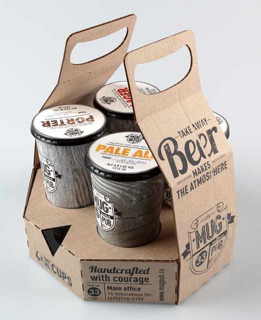
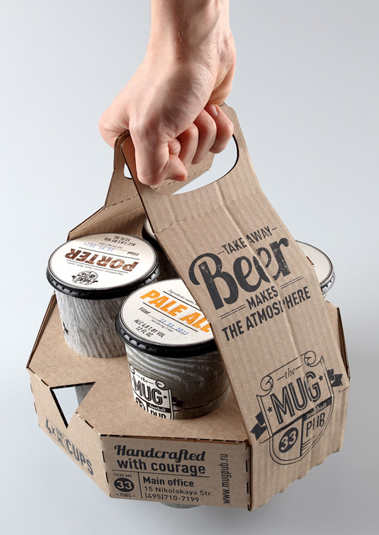
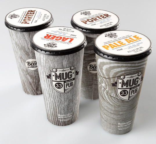
Ivan Maximov developed concept packaging for the Mug Pub. He explains, “Mug is a big chain of football pubs based in Moscow.” His new concept is take-away beer. I was interested in this design for the cups are packaged in multiples and can be easily transported by hand. Since packaging in multiplies is something that I have to consider in my brief, I found looking at Maximov's design very helpful.


The outer packaging is made from cardboard. At its base, circular shapes have been cut out, making room for the four cups that it will transport. These cups seemed to be nestled tightly into the packaging, yet they will still have to be handled with care. They would not survive the back of a van, nor are they designed for that purpose. I would therefore have to create a more secure packaging for paint tins, though perhaps this idea is a good starting point. 

---

Tetra Pak 

Using Tetra Pak for the packaging of paint is also a consideration. A lot of companies have moved to packaging drinks in Tetra Pak containers, for they are more eco-friendly, as they can be recycled and be made out of recycled material.

Vivid Water:

 Yellow + Blue Wine:

M&S Milk:

Different sizes and shapes of Tetra Pak containers can be seen here: http://productxplorer.tetrapak.com/en/packages-by-volume

However, I contacted Tetrapak.com asking if it would be possible to contain paint in Tetra Pak containers. This was the reply that I received:

Dear Martha
Thank you for contacting us
The materials on our cartons consists of layers of paper, polyethylene and aluminum (for the aseptic cartons) see

As you can see the inside of the carton is covered with a thin layer of polyethylene (to seal in the liquid and protect the product from external moisture)
The packaging material is formed to cartons inside the filling machine. As you can see it would not be possible to store paint inside Tetra Pak cartons during the filling process.


References: 
http://www.thegrocer.co.uk/fmcg/vivid-water-claims-a-tetra-pak-first/348490.article
http://www.packagingnews.co.uk/news/ms-launches-first-long-life-milk-range-in-tetra-pak-cartons/  
http://designstamped.com/2011/01/27/great-packaging-design/
http://gizmodo.com/5099105/eco+friendly-360-paper-bottle-concept-makes-tetra-paks-look-so-60s 
http://www.dieline.com/
http://designstamped.com/wp-content/uploads/2011/01/BEST-PACKAGING-DESIGN.bmp
http://lovelypackage.com/student-work-ivan-maximov/

Monday, 4 November 2013

Client Meeting

Our client came into our lecture, where he did a presentation about the company, Edward Bulmer: Pots of Paints Ltd, and answered some of our questions.


He started by explaining that Edward Bulmer was an interior design company and their paint specialised in restoring big buildings and being used on stately homes. Their paints are made from purely natural ingredients and they currently have fifty colours, including white.

Their target audience is the upper-class, which became even more clear during the presentation, as the client kept referring back to the high-quality that his audience have come to expect.

They listed Farrow and Ball as their main competitor, as well as Little Greene, Rendona paint and Ecos Organic Paint.

He said that the main positive factors of the Edward Bulmer company were its historic aspect, its health considerations to humans, how it is sympathetic to older buildings and its colour. He later went on to say that colour was the main reason why people bought their paint, that 75% of people used this company because of its colour. 

They have two types of paint: oil-based paint and solvent-based paint. The solvent-based paint is currently transported in plastic containers, while the oil-based paint is transported in metal. The client made a point of saying that you cannot put water-based paint in a metal container, as it will rust.

At the moment, their paint is transported with an outer bucket, with the inner container nestled inside. This is so that if the paint is thrown around, the actual container is more protected and if there are spills, the outer packaging helps. However, the client did say that this was a waste of resources and that they would like something more efficient. He also said that they used to put a leaflet in with the packaging, which explained how the outer bucket could be reused. Yet people merely threw the leaflets into the skip, so they no longer do this.

It costs the client money when there is a spillage of their paint, even if it is not their fault, so it would be good to create packaging that is incredibly secure and is able to withstand being thrown around by carriers. The transportation itself can be quite rough, so this would be good to keep in mind when it comes to designing the packaging. The client mentioned that Little Greene's paints packaging were the most reliable that they knew of. Little Greene have a thick cardboard inserts that sit inside the paint tin and this seems to work well.

It was also mentioned that a handle can be very useful when it comes to transportation. If the paint can be picked up easily, then there is less chance of the carrier handling it recklessly.

The client was pleased with the current rebrand of their logo and so asked for that to stay. He said that he would like the typeface and colouring to also remain, though he added that this was not set in stone.

He mentioned that the label for their packaging would cover a large number of their products, so perhaps this could be something to keep in mind when thinking that it has to match tins of a number of different sizes. The client suggested the idea of having transparent areas on the label, so that you are able to see the shiny metal of the tin through the label, and I thought that sounded like an interesting idea, if, in fact, I was to use metal for the container.

Then it came to the questions. Someone asked if they would ever consider using powder paint, but the client replied no. He said that now people expect paints to be ready for them to use immediately.

He mentioned that their target audience usually can afford to employ an interior designer, are retired and more than 50% of them use a decorator, rather than applying the paints themselves.

The packaging of Innocent Smoothies was mentioned, and though the client said he liked their design, he said that he thought humour was perhaps not the way to go with this company, as the target audience might not get it. He mentioned that the company Earthborn have taken this type of approach, though this was not what they themselves were looking for.

The fact that their paint is eco-friendly is not a driving force on their labels. The client said that they have, “Moved away from a folky, eco-look to something more traditional.” And he was pleased with this. He said that it was premium paint with a supporting eco message. The environmentally-friendly aspect of their paint was a plus, though most of their customers bought their paint for its colour.

When asked if he had considered using bio-plastics for his packaging, the client replied that he not thought of that, though he seemed intrigued by the idea.

Someone asked if their paint would ever appear in shops and the client replied that it would, though these would be interior design shops, high-end and independent. These paints would not appear in places like Homebase.

The next question regarded whether the client would like to see their paint in a clear container. However, the client said no to this, as their paint did not look particularly attractive before it was mixed up. 

We were then able to take a look at the companies previous packaging and take a look at the paint itself.

Sample pots:

 Previous packaging: