Monday, 4 November 2013

Client Meeting

Our client came into our lecture, where he did a presentation about the company, Edward Bulmer: Pots of Paints Ltd, and answered some of our questions.


He started by explaining that Edward Bulmer was an interior design company and their paint specialised in restoring big buildings and being used on stately homes. Their paints are made from purely natural ingredients and they currently have fifty colours, including white.

Their target audience is the upper-class, which became even more clear during the presentation, as the client kept referring back to the high-quality that his audience have come to expect.

They listed Farrow and Ball as their main competitor, as well as Little Greene, Rendona paint and Ecos Organic Paint.

He said that the main positive factors of the Edward Bulmer company were its historic aspect, its health considerations to humans, how it is sympathetic to older buildings and its colour. He later went on to say that colour was the main reason why people bought their paint, that 75% of people used this company because of its colour. 

They have two types of paint: oil-based paint and solvent-based paint. The solvent-based paint is currently transported in plastic containers, while the oil-based paint is transported in metal. The client made a point of saying that you cannot put water-based paint in a metal container, as it will rust.

At the moment, their paint is transported with an outer bucket, with the inner container nestled inside. This is so that if the paint is thrown around, the actual container is more protected and if there are spills, the outer packaging helps. However, the client did say that this was a waste of resources and that they would like something more efficient. He also said that they used to put a leaflet in with the packaging, which explained how the outer bucket could be reused. Yet people merely threw the leaflets into the skip, so they no longer do this.

It costs the client money when there is a spillage of their paint, even if it is not their fault, so it would be good to create packaging that is incredibly secure and is able to withstand being thrown around by carriers. The transportation itself can be quite rough, so this would be good to keep in mind when it comes to designing the packaging. The client mentioned that Little Greene's paints packaging were the most reliable that they knew of. Little Greene have a thick cardboard inserts that sit inside the paint tin and this seems to work well.

It was also mentioned that a handle can be very useful when it comes to transportation. If the paint can be picked up easily, then there is less chance of the carrier handling it recklessly.

The client was pleased with the current rebrand of their logo and so asked for that to stay. He said that he would like the typeface and colouring to also remain, though he added that this was not set in stone.

He mentioned that the label for their packaging would cover a large number of their products, so perhaps this could be something to keep in mind when thinking that it has to match tins of a number of different sizes. The client suggested the idea of having transparent areas on the label, so that you are able to see the shiny metal of the tin through the label, and I thought that sounded like an interesting idea, if, in fact, I was to use metal for the container.

Then it came to the questions. Someone asked if they would ever consider using powder paint, but the client replied no. He said that now people expect paints to be ready for them to use immediately.

He mentioned that their target audience usually can afford to employ an interior designer, are retired and more than 50% of them use a decorator, rather than applying the paints themselves.

The packaging of Innocent Smoothies was mentioned, and though the client said he liked their design, he said that he thought humour was perhaps not the way to go with this company, as the target audience might not get it. He mentioned that the company Earthborn have taken this type of approach, though this was not what they themselves were looking for.

The fact that their paint is eco-friendly is not a driving force on their labels. The client said that they have, “Moved away from a folky, eco-look to something more traditional.” And he was pleased with this. He said that it was premium paint with a supporting eco message. The environmentally-friendly aspect of their paint was a plus, though most of their customers bought their paint for its colour.

When asked if he had considered using bio-plastics for his packaging, the client replied that he not thought of that, though he seemed intrigued by the idea.

Someone asked if their paint would ever appear in shops and the client replied that it would, though these would be interior design shops, high-end and independent. These paints would not appear in places like Homebase.

The next question regarded whether the client would like to see their paint in a clear container. However, the client said no to this, as their paint did not look particularly attractive before it was mixed up. 

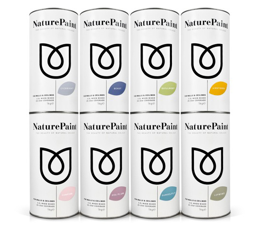
We were then able to take a look at the companies previous packaging and take a look at the paint itself.

Sample pots:

 Previous packaging: 


Monday, 28 October 2013

Inspiration Search: Country Homes & Interiors

It mentioned in the brief that the "target audience" for this project was likely to read magazines such as Country Homes & Interiors, Period Living, Country Life, English Home and House and Garden. I found Country Homes & Interiors and decided to flick through it in search of inspiration.
The magazine itself is quite expensive, though not overly overpriced - £3.99 - and targeted toward middle-aged homeowners, the same as my target audience for the brief. The magazine's interior focuses specifically of the decorative. It ranges from shabby chic to bold and ornate designs. The audience is definitely more upper class than anything else and the interior decoration screams sophistication and class.

The colours used throughout the magazine are muted, soft and follow a particular colour scheme. For example, one page consisted of warm autumnal colours, such as browns and yellows, while another showed only shades of blue and white. Bright colours have been used sparingly - if at all - and contrasting colours rarely used together. The magazine was also themed for the season: Christmas and autumn features heavily.

Country Homes & Interiors also referred to "green" issues, I was pleased to note. Though this was mainly about how to save your own money: How To Save Money On Energy Bills, How To Grow Your Own Fruit, Save Money With Your Own Solar Energy etc. But there was also articles on the best eco-friendly products and how to reuse things around your house.


References:
http://www.housetohome.co.uk/
http://www.housetohome.co.uk/articles/greenliving/page-2#results

Brief Overview


Last week we were given the brief for our final project. I read through this and made some notes:

- We are designing 3D working prototypes of eco-packaging concepts for natural paint company: Edward Bulmer: Pots of Paint Ltd.
- They are expanding their range of natural paints

- Need to be able to protect and transport paints in multiples of twos

- Sustainable packaging

- Need a physical 3D mock up

- Designing for 2.5 litre paint, which prices roughly about £30


Needed:

- Clear consideration of material’s eco-profile (eg the plastic vs metal containers debate).

- Innovative new ideas for carrying liquids (i.e paint in tetrapacks or refillables maybe?).
- Advantages and limitations of the different ideas and findings (eg costs).
- Background evidence that you have looked into PoP’s competitors and others in the sector (i.e.
F&B, Little Greene, Marston & Langinger, Auro).
- Visuals (photoshop or illustrator) showing how your single 2.5 litre pot might work/look in 3x
different circumstances: On shop shelf, with possible second use, and with poss refill options.
- Visuals (photoshop or illustrator) showing your best solutions to the most effective transport of 2x 2.5 litre paint containers together (i.e with a courier service). (PoP) rarely ship paint in quantities as large as whole pallets. This must be justified/supported in your research findings. 


Target Audience:
• Middle aged to retired homeowners who read House and Garden 
• Individuals who have a solid view of tradition in colour choice 
• Individuals who employ decorators to use our paint
• Interior designers for the above 
• Individuals who have a more functional attitude to packaging 
• Individuals for whom colour is the main selling point 
• Environmentally conscious customers of all ages who have some disposable income, and will do their own painting 
• Individuals who are likely to have heard about Pots of Paint from their website. 


Key Consumer Insight:
"My home has to be beautiful and now that the children have flown the coup I finally have the time to fashion the house how I’d like. I go to all the glossy magazines for inspiration, Country Homes & Interiors, Period Living, Country Life, English Home, House and Garden, although I also appreciate professional help when it comes decor. For me it has to be classical, I love antiques and traditional colour schemes compliment them beautifully. I am prepared to pay a bit more for quality and although I like to shop on the internet, I love to seek out those unusual little shops that still supply traditional products. And of course one must consider the environment."


QUESTIONS TO ASK CLIENT NEXT MEETING:
  • Would you ever consider selling your paint in powder form? Perhaps for samples?
  • Regarding previous designs, are there specific areas that you would like to be improved?
  • Regarding previous designs, is there anything that you liked/want to keep

  • What is the typical transportation method for your paints?
  • Do you have any connections to social media? 

Task 3 - Sketches

(To add)

Tuesday, 15 October 2013

Task Three: Research

Earthborn Paints
The ingredients for Earthborn paints are carefully selected, with strict focus on the environmentally friendly. They are designed to be healthier to live with and safer for the environment. They even go as far as listing the ingredients that they use on the side of their tins.
On their website, I could find numerous examples of how their paint is eco-friendly, but could find no information about their packaging, apart from that they use 'tins', rather than plastic tubs. I emailed the company to ask if their packaging was also environmentally friendly and they replied: "Our tins are made from 100% recyclable steel and therefore go on to be used to make other things."
However, their strong brand definitely gives the appearance of being good for the environment. I have noticed a trend of labels displaying flowers or grass when the company wants to give the impression of their product being good for the environment, and I think this definitely works. When we think of the environment, we think of greenery, of trees, flowers and grass. And I particularly like how Earthborn turned a paint brush into a grassy garden, complete with flowers, as this really brings home their point. 

Nature paint
Nature Paint is presented in powder form, meaning that it weighs about 70% less than standard liquid emulsion paint. This means, because it is so light and presents no hazards to people and to the environment, you can actually receive Nature Paint through the post, something that would be unthinkable with liquid paints. This also saves transportation fuel, which goes a long way to help the environment.
Nature Paint is also the first paint brand to prove it has no VOC's. Absolutely none. It is made from non-toxic, natural and locally sourced ingredients. For example, they use china clays from Cornwall, where the company is based.
Their packaging is 100% recyclable. B&B Studio, the designers, explain, “We normalised the brand by introducing a classic paint tin shape, but crafting it from recyclable card. Unlike normal paint tins, which are difficult to dispose of, these cylinders can be safely composted.”

They also say of their design, "Our black and white identity is designed to disrupt the category with a pure, simple aesthetic that lets each colour chip shine from the pack. Its clarity of execution speaks of performance, while the brand mark communicates naturalness, cleverly combining a flower and a droplet – a hint that the product is mixed with water."


Plant Your Dreams and Let Them Grow


This packaging, for tulip bulbs, has a natural, simplistic, yet creative appearance. The illustrator, Sophia Georgopoulou, took inspiration from various names of the tulip flower (such as Red Emperor, Pink Diamond, Sweetheart, etc.) to create her quirky and humorous hand-drawn illustrations. Minimal colour has also been used, which saves ink. The packaging can be recycled and the added touch of straw, woven to hold the top of the package together, reinforces that natural, eco-friendly look and touch.


London Bio Packaging
This company develops and supplies a large range of sustainable packaging. Their packaging is made from renewable or recycled resources, has a lower carbon footprint and can be composted or recycled. London Bio Packaging works with over 1000 food businesses with the goal of supplying as much sustainable packaging as they can, to work toward a better future.


References:
http://www.thedieline.com/blog/2012/11/7/nature-paint.html
http://www.packagingoftheworld.com/2011/06/plant-your-dreams-concept.html
http://earthbornpaints.co.uk/
http://www.dogoodbranding.com/work/earthborn/
http://www.londonbiopackaging.com/ 


Wednesday, 9 October 2013

Task Two

Vegetable Based Ink

Printing inks are mostly petroleum-based with alcohol-based solvents. This means that, as the alcohol and petroleum evaporate, VOC's (Volatile Organic Compounds) are emitted. VOC's can prove to be a health hazard to pressroom workers, as well as contributing to the ozone pollution or photochemical smog. A solution to this is introducing vegetable based inks. 

Vegetable based ink is an environmentally friendly alternative to printing. The base liquid of the ink is made from numerous vegetables, such as corn, walnut, coconut, linseed, canola and soy bean. They release only 2-4% VOCs into the atmosphere when they dry (petroleum inks emit 25-40% VOCs) , while they are also a renewable source.


HP Printers 

HP printers take great consideration when it comes to how their products effect the environment. The company has even earned CDP top performance band rating in 2013.   

HP ensures that computer hardware, empty HP printing supplies and other items are recycled responsibly. HP Inkjet and LaserJet cartridges can be recycled for free. Usually, you will receive packaging with your inks, which you can use to send back the ink cartridges. If not, you can go to their website and print off a pre-paid address and stamp. 

HP has produced more than 1.5 billion HP LaserJet and ink cartridges that have been made from recycled plastic. HP is also focusing on using renewable plastics. Instead of using plastics that come from oil, they are looking into plastics that can be made from plants. These plastics will be composted, rather than ending up in a landfill. 


You can see their further goals here:


References: 

Tuesday, 1 October 2013

Compostable Carrier

-Co-operative's Compostable Carriers-
When I asked for a bag at Co-op a few days ago, I was surprised to note that, when the bag was handed to me, it felt different, much smoother than your regular plastic bag. On closer inspection, the bag was revealed to be a “compostable carrier”. The bag could be reused for shopping and to collect vegetable peelings, while it also fits compost caddies. When worn out, you can put this bag in a compost bin and it will turn into compost. I was perhaps far more excited at this than I should have been, but it seemed as though Co-op had taken a step in the right direction.

According to a Christian science monitor newspaper, less than 1% of bags are recycled and it costs more to recycle a bag than it does to produce a new one. Yet, plastic bags cause numerous problems. Because they are non-biodegradable, landfills are overflowing with them. Not only that, but it puts nature – particularly animals – in danger. Gruesome images have been shown over the years of the affect plastic bags can have on animals and their habitats. In my opinion, we should be doing more, such as reusing bags when possible.

 The Co-operative’s environment manager, Iain Ferguson, said: “Every compostable carrier bag used is one less conventional plastic shopping bag in circulation. We believe they will have a significant impact upon the number of plastic bags which end up in landfill sites every year.
“Our aim is to enable our customers to recycle more of the products they buy from us – from the leftover food and packaging, right through to the bag they use to carry their purchases home.”

References: